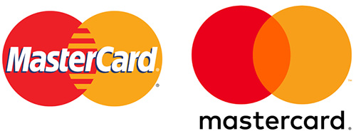
You may have noticed the trend of companies simplifying their brands and launching minimalist logo updates.
As shared in Ben Schott’s Bloomberg Quicktake video on the trending direction of brand identity, Mastercard, Pringles, Uber, Burger King, and Mailchimp are some of the many brands that have recently stripped their logos of excessive details, even to the point that some may question the look of the new updates.
But why?
There are two major reasons why logos are getting simpler.
Recognition
By reducing the complexity of the logo design, it makes it easier to recognize and thus more memorable, which is key to successful branding. Simpler, flat designs with vector-friendly shapes and clean typography are quicker to understand and reflect a modern look.

Also, minimalist logos can be ineffective if they don’t indicate what the company does.
An effective logo hints at what product or service is being offered. Baskin-Robbins has its “31” flavors subtly designed into their “BR” brand icon. And Amazon’s logo has an arrow that points “from a-z” implying that you can get everything from a to z from them. The arrow also has a smile shape, a nice psychological design touch.
The Mobile-Era:
Most online content is now being viewed on a mobile device. This rise in small screen usage has created a need for brand identity to display across a far wider range of formats.
An effective logo needs to be highly scalable, without losing its ability to communicate no matter what the medium (print or digital) or its size. Dark mode display is another trend that a simple logo is far better suited for than a complex one.
To geek out more, watch Ben Schott’s video.
